Client
Deliverables
Bringing Retur together
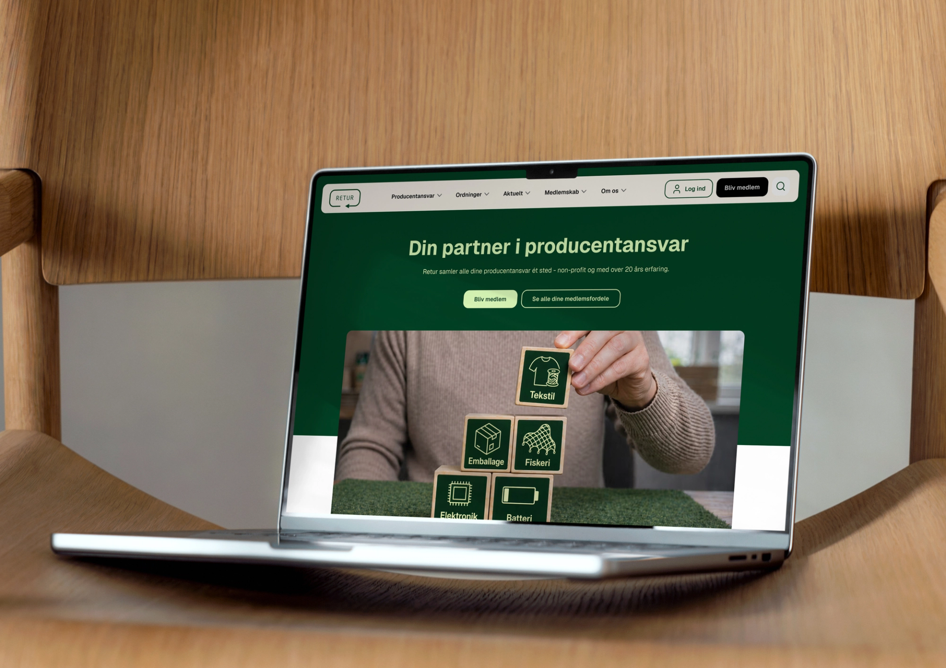
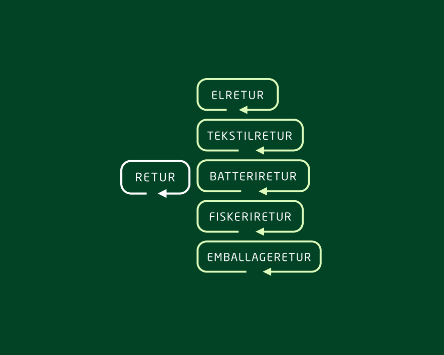
Retur manages Extended Producer Responsibility (EPR) for five schemes - Elretur, Batteriretur, Emballageretur, Fiskeriretur and Tekstilretur - covering electronics, batteries, packaging, fishing gear and textiles. The organisation had grown, and so had its ambitions. It was time for the digital side to catch up.

The brief
Retur isn't one thing. It's five schemes, one shared secretariat, and a single ambition: making it easier for Danish businesses to meet their EPR obligations.
But when a company went looking for answers: Are we covered? What do we need to do? Who do we talk to?… They ran into five separate websites. Five different looks and feels. And a lot to navigate.
The task was to bring it all together:
Turn Retur into one place with one voice, one structure, and one experience that guides users from their first question all the way to action.
The solution
The first step was figuring out what actually existed - and what was actually needed.
Five websites. Hundreds of pages of content built up over many years. And one question running through all of it: what's general knowledge about EPR, and what's specific to each individual scheme?
That's harder to answer than it sounds, because both matter, and because the content had grown organically rather than by design.
That's harder to answer than it sounds, because both matter, and because the content had grown organically rather than by design:
- The business trying to work out where its responsibilities lie
- The member navigating their way to reporting
- The prospective member weighing up whether Retur is the right fit
Three different journeys, one place to start.
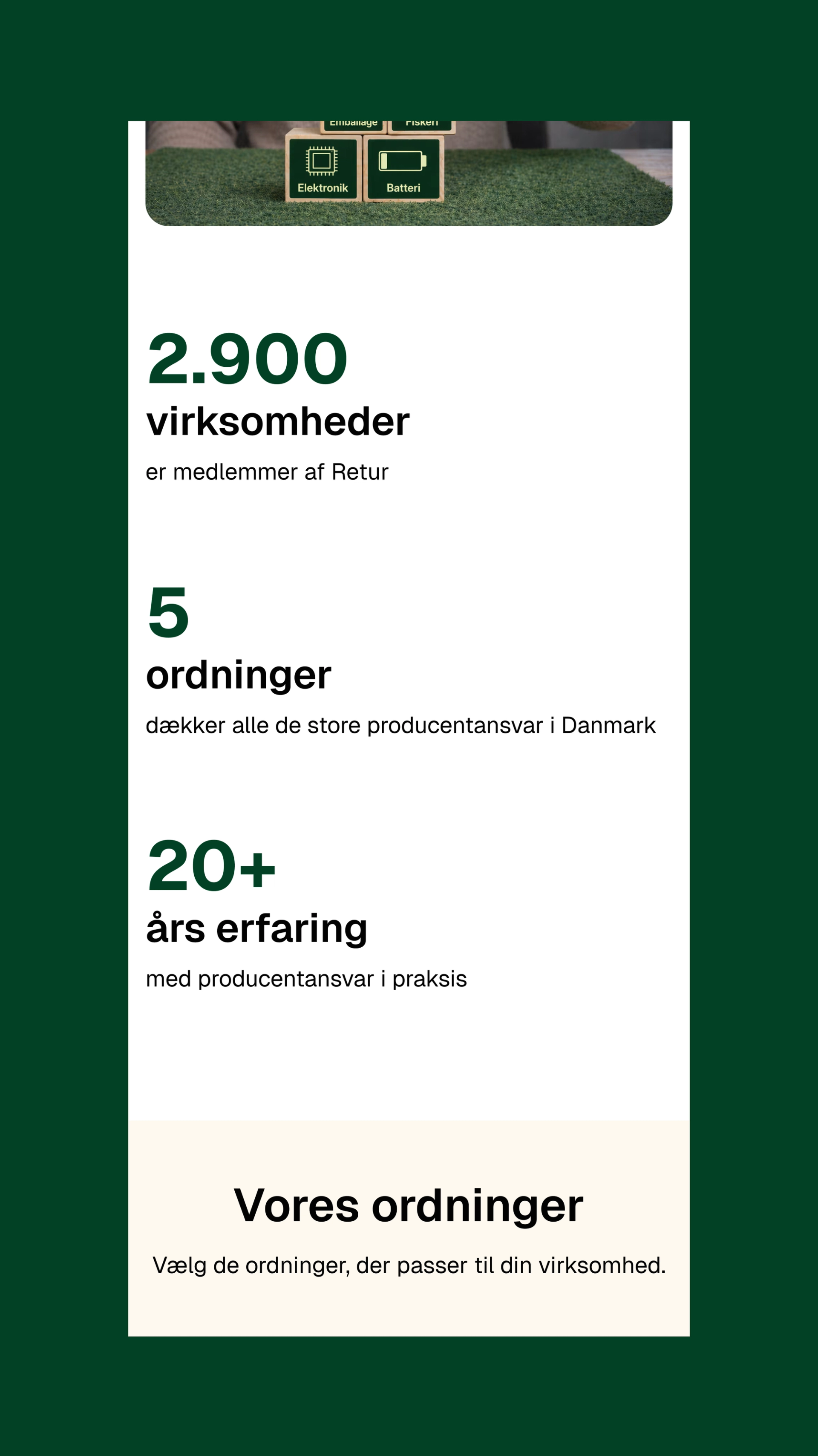

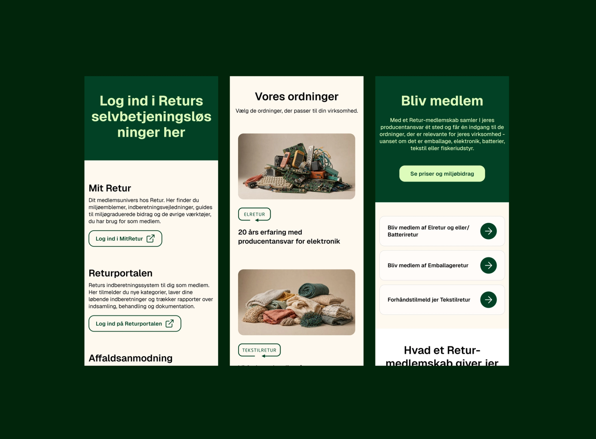
For Retur's communications team, the new site is also a new working tool. A CMS they can run themselves, without looping in a developer every time a new theme page needs to go up.
“Retur operates in a field that can be genuinely complex for businesses to make sense of. So our instinct, early on, was to build that complexity into the new site - more options, more navigation paths. Adapt pushed back on that, and kept us anchored to a simple, modular structure even when we had doubts. Today it makes complete sense. It's simpler for our users - and simpler for us.”Emil Rønnow, Senior Communications Consultant, Retur
One Retur, five schemes
Along the way, it became clear that the challenge wasn't finding room for everything. The challenge was building structure and setting priorities, so users wouldn't be met with complexity they didn't need.
The new retur.dk brings all five schemes together under one roof - not by erasing the differences between them, but by giving them a shared framework.
The content has been trimmed, restructured, and made accessible even to users with no prior knowledge of EPR terminology. And the structure is built to grow, with room for future schemes and a members' area planned behind login.
Result
A unified retur.dk that takes users by the hand - from "what is EPR?" to "become a member" to "log in and report." A stronger digital brand. And a foundation ready to carry Retur forward.
“As a UX designer, I often see complexity met with an instinct to add - more content, more pages, more navigation options. But more often than not, it's the opposite that's needed. With Retur, we spent much of our time clearing away, cutting to the core, and prioritising. That didn't just make things simpler for users - it gave Retur a solid foundation that can grow with new needs down the line.”Palma, UX Designer, Adapt
This wasn't just about moving existing content into a new frame. It was about clearing away the clutter, simplifying, and bringing structure to a large body of highly specialised knowledge. The result is a better experience for users and a platform that's far more robust and future-proof for Retur.
Contact us
Want to know more? We'd love to talk.
Ask Hybel
Executive Advisor