Stop Designing for Yourself. Start Designing for Your Users
What changes when you stop designing for yourself — and start designing for the people who actually use your product.

“Let’s do it this way — I like it better. It looks nicer to me.”
Caring about how a product looks is natural. But UX decisions shouldn’t start with taste.
They should start with a question:
Is this clear, usable, and helpful for the user?
We design for the people who use the product, not the people who create it.
UX isn’t built for designers or stakeholders — it’s built for people who arrive with a goal and expect to achieve it effortlessly. When design decisions are driven by personal preference instead of user behavior, the result is often lower conversion, higher bounce rates, and frustrated customers — even if the interface looks nice.
This article explores what happens when design decisions are driven by personal taste instead of user needs — and how shifting the focus to users leads to better products and better collaboration.
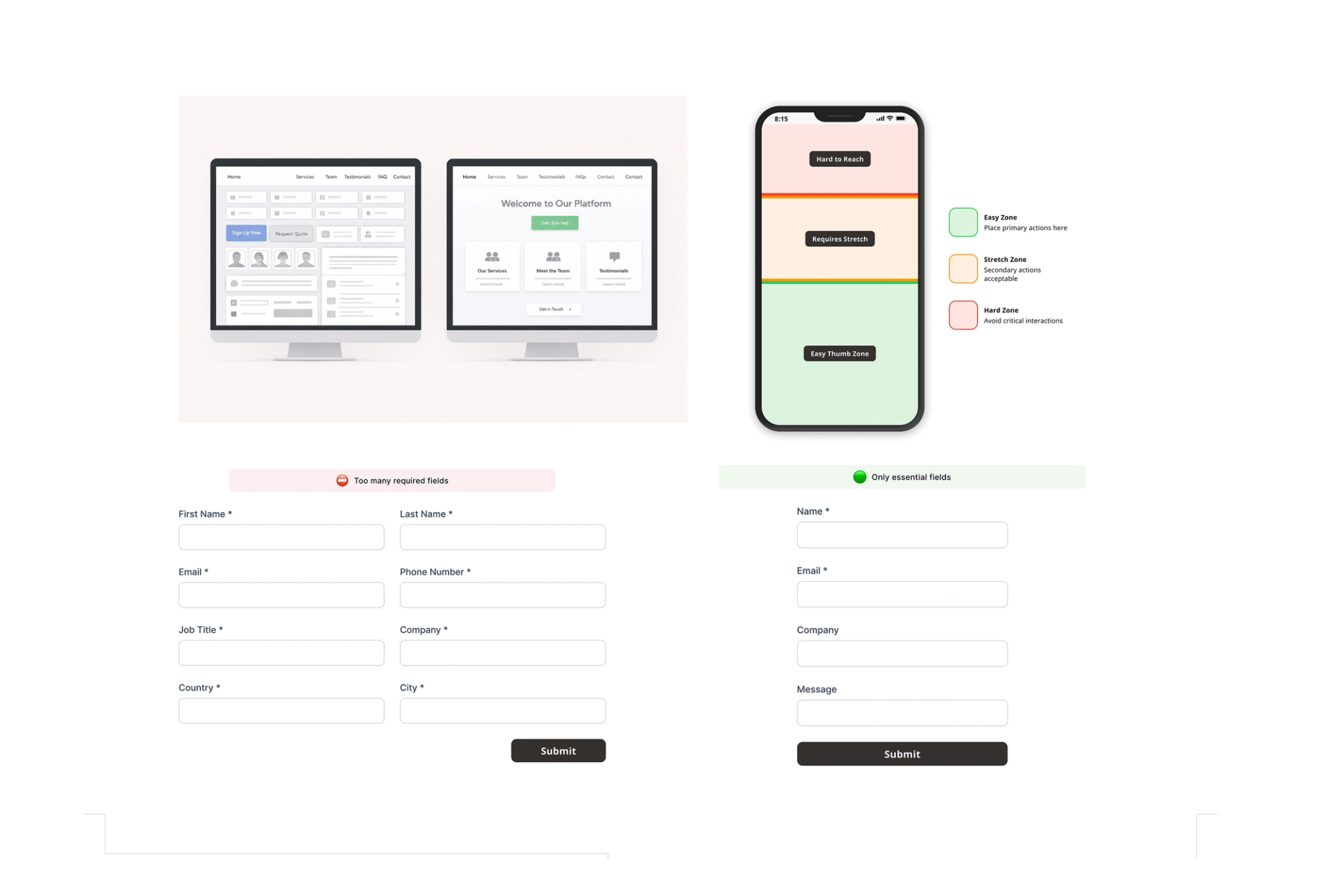
“I Want Everything on the Homepage”
Client says:
“Let's show everything – services, team, testimonials, contact info, FAQs. Users need all the information upfront.”
Reality:
Overloaded homepages create decision paralysis. Users skim, feel overwhelmed, and bounce without taking action.
UX truth:
A homepage should answer "What do you do?" and "What should I do next?" – not display your entire sitemap.
Example:
In one e-commerce project, heatmaps showed that most users never scrolled past the second screen when the homepage included too many sections. After reducing it to a few core sections with clear CTAs, scroll depth and primary CTA engagement increased significantly.
“Mobile Isn’t Our Priority Right Now”
Client says:
“Most of our traffic is desktop – we'll optimize mobile later.”
Reality:
Mobile users often leave faster — not because they matter less, but because the experience wasn’t designed for one-handed, on-the-go use.
UX truth:
Mobile-first isn’t about traffic share. It’s about designing for real-life usage.
Example:
Primary actions placed at the top of the screen work on desktop, but fall into hard-to-reach zones on mobile. Moving them into bottom bars or sticky buttons keeps actions within thumb reach and reduces friction.
“The More Fields, the Better”
Client says:
“Let’s ask for job title, phone, industry, country — more data is better.”
Reality:
Every extra field adds friction. Long forms feel risky and exhausting.
UX truth:
Ask only what’s needed to start the relationship. Trust grows later — data collection can too.
Example:
Reducing a long form to only essential fields significantly increased completion rates and reduced drop-offs.
Accessibility: Beauty Is Not Enough
Minimal design often looks great — until real users try to use it. Accessibility isn’t about edge cases. Accessibility issues affect users in everyday situations — bright sunlight, one-handed use, small screens, stress, fatigue — not just permanent disabilities.
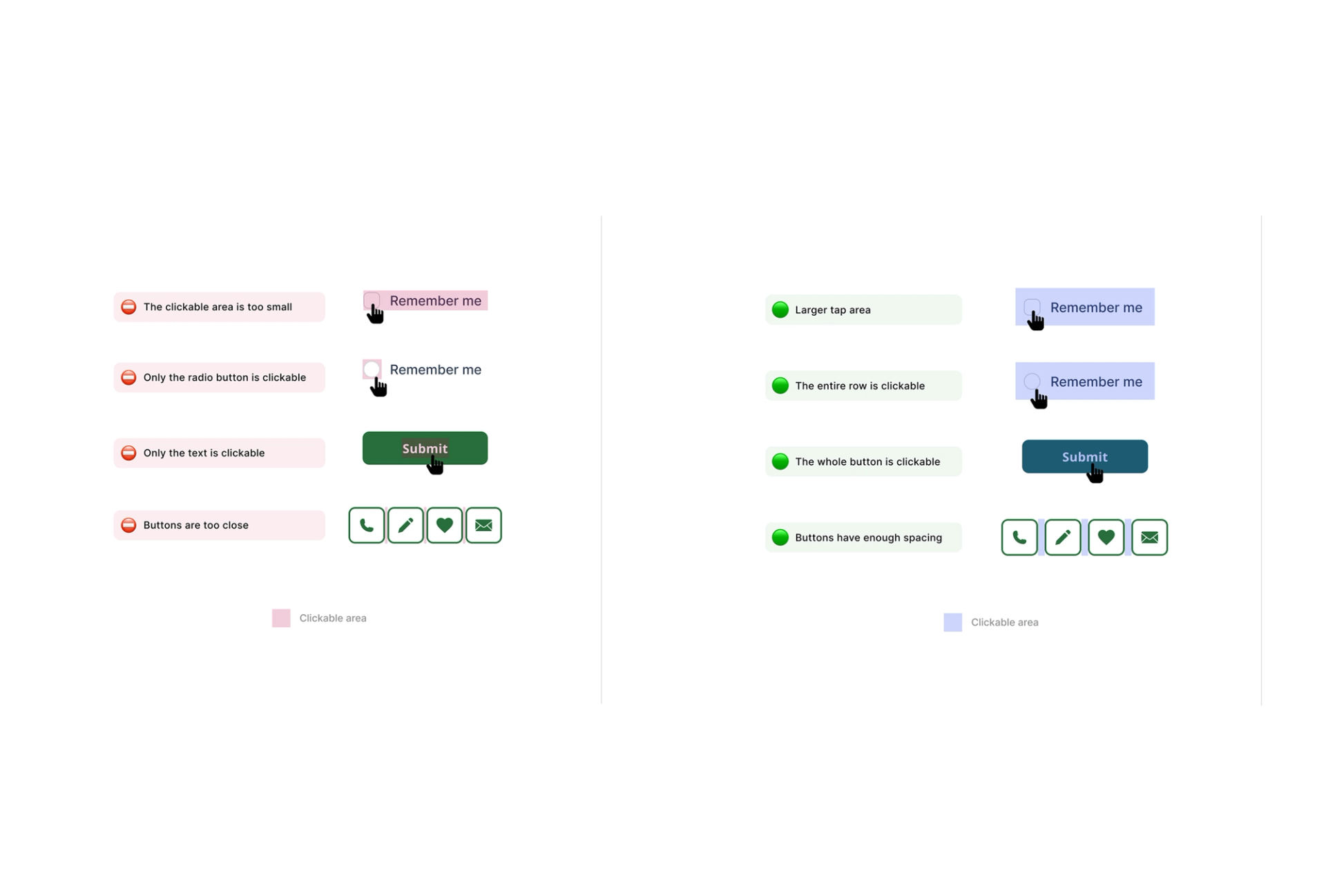
1. Clickable Areas Are Too Small
Nice-looking buttons fail when users can’t tap them — especially on mobile, in motion, or with one hand.
Increasing tap targets to 44px dramatically reduces frustration.
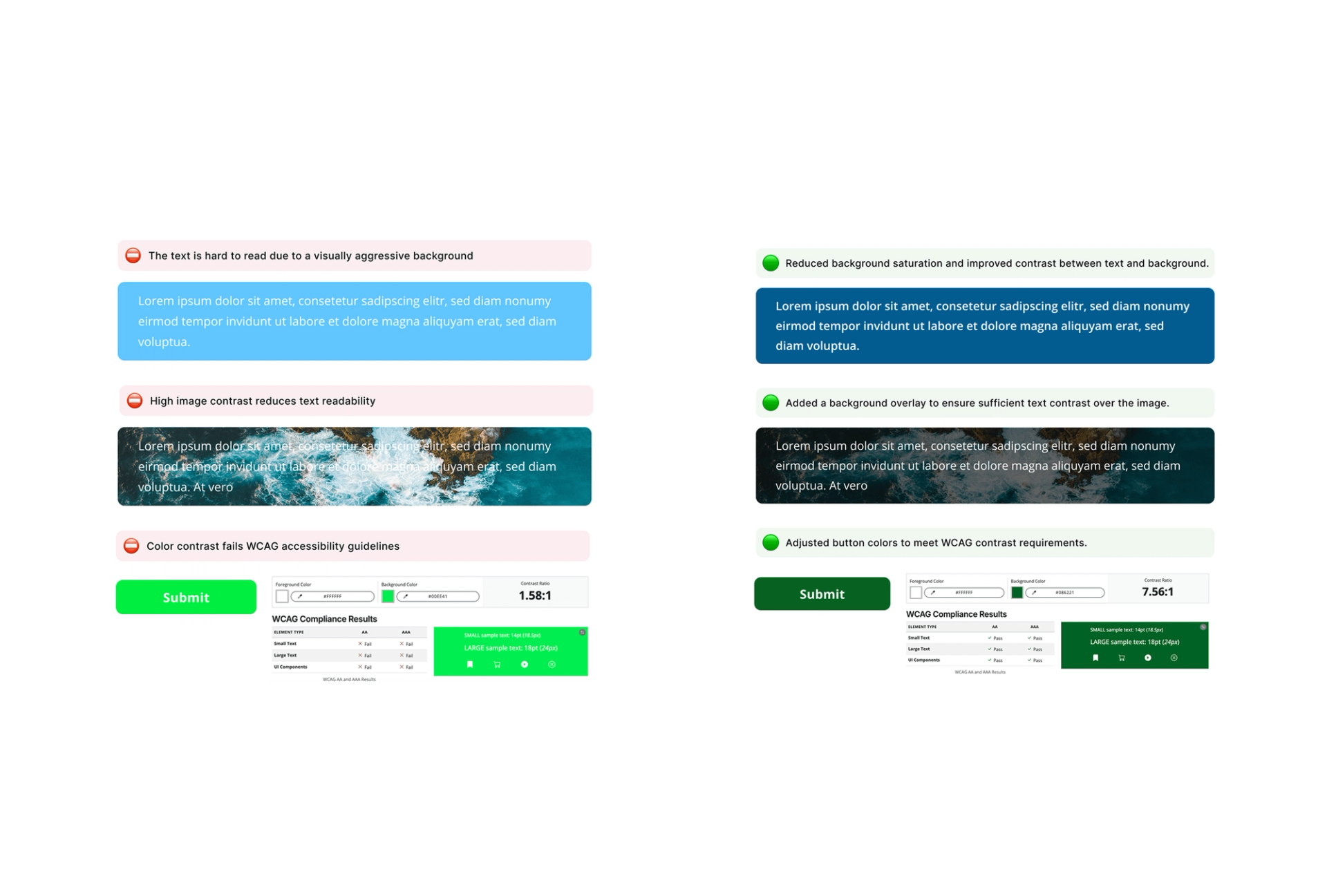
2. Insufficient Color Contrast
Text and UI elements do not have enough contrast against their background, making content hard to read and failing WCAG accessibility guidelines.
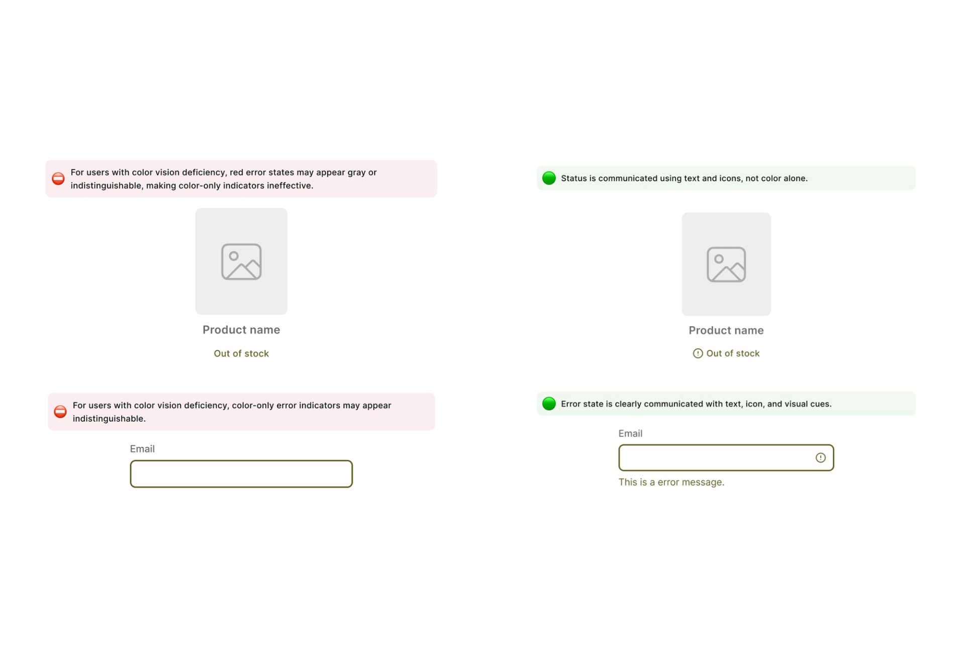
3. Color Carries Meaning Alone
When color is the only indicator, critical information can be missed. Users with color vision deficiency may not perceive red error states, making status unclear or misleading.
Color should never be the only signal.
Accessibility Is Everyone’s Responsibility
Accessibility isn’t optional.
It’s a requirement — legally, ethically, and commercially.
Design Isn’t Working If the User Has to Guess
Before finalizing a design, ask:
- Does this help users complete their task faster?
- Is it understandable at first glance?
- Is it functional — or just decorative?
- Does it fit real-world usage, especially on mobile?
These questions help teams avoid subjective debates and focus on outcomes that directly impact revenue, support load, and user trust.
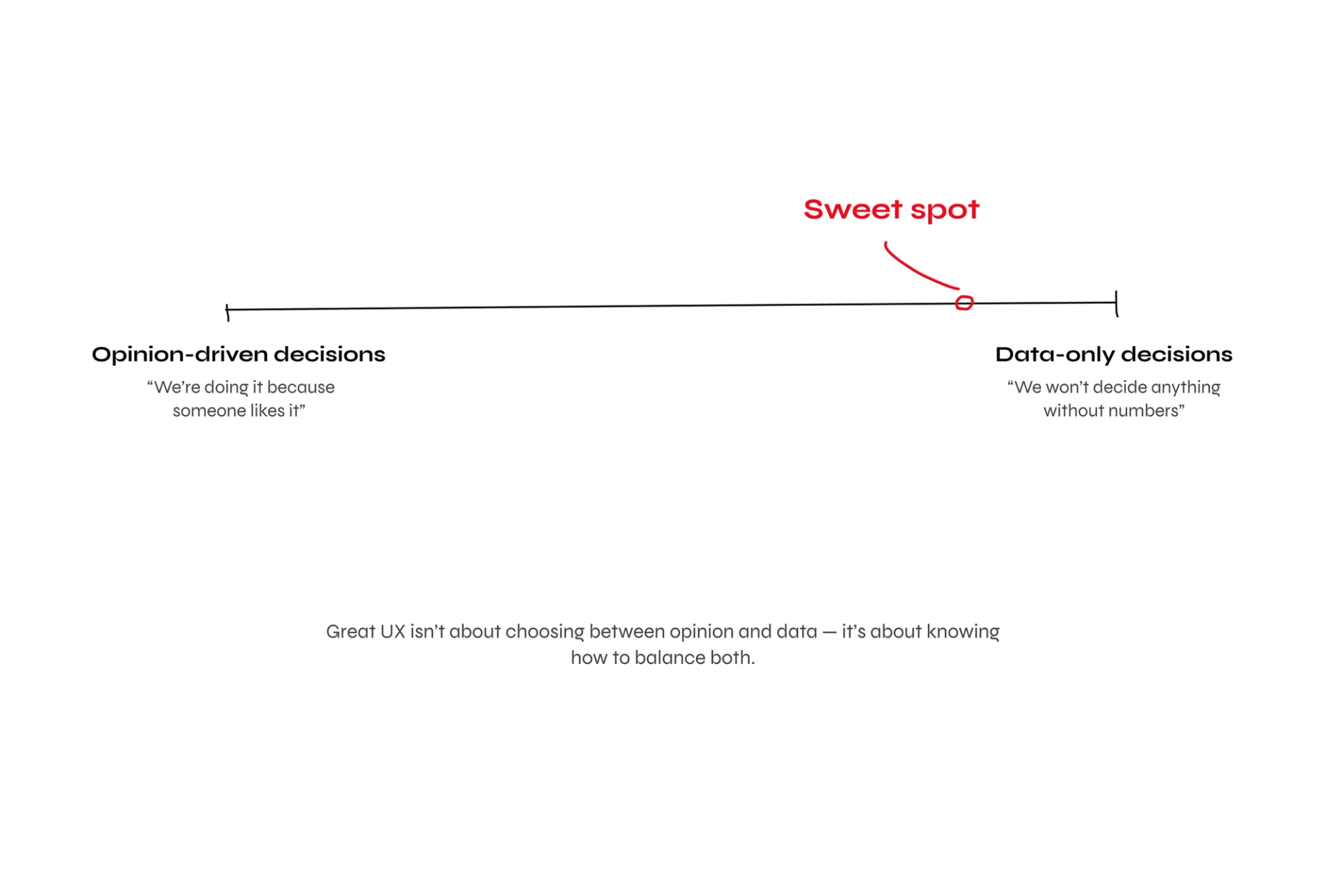
Data Ends Debates — and Builds Trust
When opinions clash — “I like this better” — data becomes a neutral voice.
In one project, user research showed visitors cared most about promotions hidden at the bottom of the homepage. After moving them higher, clicks and conversions increased.
Useful signals include:
- Heatmaps and analytics
- User testing
- A/B testing
- Surveys
But data doesn’t answer everything. As Spotify’s Head of Research Nhi Ngo says:
“When data doesn’t provide clarity, it’s normal to rely on humanity.”
Data doesn’t replace expertise — it supports it. Design decisions still require interpretation, context, and responsibility.
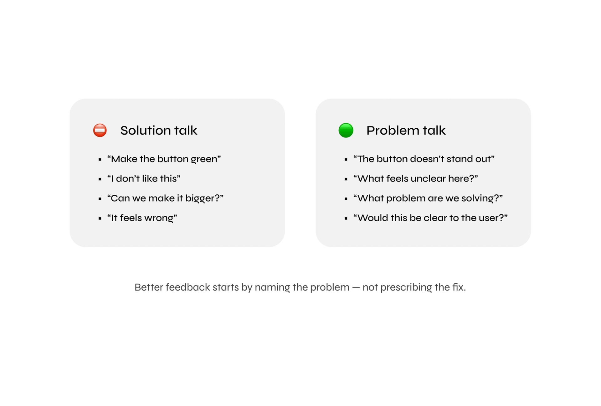
Talk About the Problem, Not the Solution
Great UX comes from collaboration.
Instead of:
- “I don’t like this button”
- Try: “What feels unclear here?”
Instead of:
- “Make it bigger”
- Ask: “What problem are we solving?”
This keeps feedback focused on outcomes — not personal taste.
Great UX Feels Invisible
UX isn’t about looking modern or minimal. It’s about helping people achieve their goal quickly, confidently, and without friction. When design works, you barely notice it. When it doesn’t — you feel it immediately. So next time you make a design decision, ask:
Does this help the user — or just satisfy our aesthetic preference?
If users struggle, it’s rarely because they’re careless — it’s usually because the design didn’t guide them clearly enough. Because great UX is when a user completes their task and walks away thinking:
“That was easy.”
Let's talk
Good UX doesn't happen by accident — it starts with asking the right questions. If you'd like to discuss how user-centred design could improve your product, let's talk.

Linas Balke
CEO of Adapt Lithuania